What makes a good business card?
The smallest piece of your brand does a lot of work. What to include, what to leave out, and why the back of the card matters.
In this article6 sections
A business card is the smallest thing you will ever print and one of the hardest working. It is handed over in the middle of a conversation, glanced at for a second or two, then put in a wallet, a drawer or a stack of other cards. Weeks later someone finds it and has to remember who you were and why they kept it.
That is a lot to ask of a piece of card the size of your palm. Most cards fail not because the design is ugly, but because they try to do too much, or leave out the one detail the person actually needed. Here is what to think about before you send anything to print.
Start with what the card is for
Before choosing a colour or a font, answer one question: what should happen after you hand this over? For most businesses the answer is simply they should be able to reach me. For others it is they should look at my work first, or they should message me on WhatsApp. The answer changes the design.
A card for a tradesperson who wins work by phone should make the number the loudest thing on it. A card for a designer or a caterer, where people want to see the work before they call, might lead with a QR code to a portfolio or a social page. A card handed out at a conference, among fifty others, needs something that makes it recognisable a week later.
Decide the one job first. Everything else on the card is either serving that job or getting in its way.
The details that belong on it
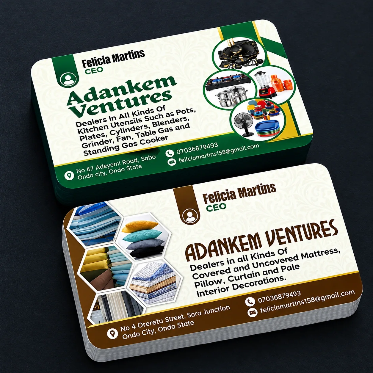
Almost every card needs five things: your name, what you do, the business name, one reliable way to reach you, and where you are based if location matters to customers. Everything beyond that is optional, and optional things are usually what make a card feel cluttered.
- Your name and role — so the person remembers who they spoke to. A plain role like “Baker” or “Electrician” is often clearer than a formal job title.
- What the business does — one short line. “Kitchen utensils and home fittings” tells a stranger more than a clever tagline does.
- One primary contact — the number or address you actually answer. Listing four channels makes the reader choose, and hesitation loses enquiries.
- A second contact, smaller — an email or a social handle, set below the main one rather than beside it.
- Location — a street and town if customers visit you. A full postal address is rarely needed on the front.
Two common mistakes are worth naming. The first is listing every phone number in the business; pick the one that gets answered. The second is a personal email address that undercuts the rest of the card — an address at your own domain costs little and reads as more established.
Type size and legibility
Cards are read at arm’s length, often in poor light, sometimes by people who need reading glasses and do not have them to hand. Type that looked comfortable on your screen at 200% can be a struggle on the finished card.
As a working minimum, keep contact details at 7–8 pt and your name a little larger. Below about 6 pt, small print starts to fill in and lose definition, particularly on uncoated or textured stock. If a line will not fit at a readable size, that is a sign there is too much on the card — not a reason to shrink the type.
Contrast matters as much as size. Dark text on a light background is easiest, light text on a dark background works well for a name or a logo, and mid-grey text on a mid-grey background defeats everyone. Avoid setting fine detail in a light weight over a photograph.
Weeks later someone finds the card and has to remember who you were, and why they kept it.
Leave the edges alone, too. Trimming has a small tolerance, so anything closer than about 3 mm to the edge risks being cut into. Keep text and logos inside that margin and let background colour run past it.
Using the back well
Half the surface you paid for is on the back, and a surprising number of cards leave it blank. It is the cheapest space in your marketing, and it is where a card earns its keep.
Some of the most useful things to put there:
| If you want the card to… | Put this on the back |
|---|---|
| Explain what you actually sell | A short list of services or product lines |
| Show the work | One strong photograph, or a QR code to a gallery |
| Get people to message you | A QR code that opens a chat or a saved contact |
| Stay on a desk | Something useful — a size chart, a conversion table, an appointment line |
| Be recognised in a stack | A full-bleed colour or pattern from your brand |
If you use a QR code, test the printed one with two or three different phones before approving the run, and make sure it points somewhere that will still exist next year. A code linking to a page you later delete turns a good card into a dead end.
One caution on full-colour backs: a heavy dark ink coverage will show every fingerprint and can scuff at the edges. If you want a dark card, ask about a matt or soft-touch finish.
Stock and finish
Weight is the first thing people notice without realising it. A flimsy card signals a flimsy business. Most commercial cards sit around 300–400 gsm; below roughly 250 gsm a card starts to feel like a flyer, and it will not survive a wallet.
After weight comes surface, and the choice is mostly practical:
- Matt or silk lamination — soft, modern, resists fingerprints, and slightly harder to write on.
- Gloss — makes photographs and strong colours sing, but shows marks on dark designs.
- Uncoated — natural and easy to write on, which matters if you add prices or appointment times by hand. Colours print a little softer.
- Spot finishes — spot UV, foil or embossing on a logo. Used on one element they look considered; used on everything they look busy.
Whatever you choose, ask to see the finished card before the full run is produced, and look at it in daylight rather than under office lighting. Screens are backlit and flatter colours; a printed proof tells you the truth.
Before you approve the print
- The card has one clear job, and the design serves it.
- Name, role, business, one primary contact and location are all present.
- Contact details are 7 pt or larger, with strong contrast against the background.
- Nothing important sits within about 3 mm of the trimmed edge.
- The back is doing something useful.
- Any QR code has been scanned from the printed proof on more than one phone.
- Every phone number, email address and spelling has been checked by a second person.
- The stock weight and finish suit how the card will be used and stored.
If you would like your cards designed as well as printed — or you have a design and want a second opinion on it before the run — our Business Cards service covers both. We’ll confirm the stock, finish and quantity with you before anything goes to press.